【簡兆芝室內設計 簡兆芝】柔曦明敘木語 共映天成雅弧
本文由 OPEN編輯部 撰寫
設計概念 Design Concept
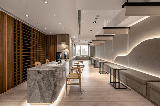
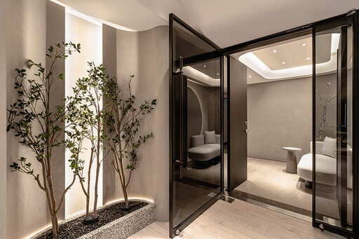
沿循斑駁紋理的曲弧壁面轉入門中,映入眼簾的點點綠植為空間灌注盎然生機,而漫佈壁面的和煦光暈向內蔓延,點亮由溫潤木韻及細膩石材拼築成的樸實長廊,與廊道盡頭的明亮日光相迎、交融,齊組清新柔和的舒心環境。
呼應企業商標的圓潤造型、以及提供女性客群為主的醫美服務,簡兆芝室內設計 簡兆芝 主持設計師 於多處立面、天壁匯入流線、圓弧設計,象徵女子優雅的身體曲線,並將業者「以人工美呈現自然美」的理念作為設計核心,藉由同是人為的室內裝修展現天成美感,全案鋪敘木質、大理石與仿混凝土質感的特殊塗料,輔以入口旁植栽區、走廊末端引入的天光,挹來置身戶外般的純淨自然氣息,間或點綴布藝、鍍鈦鐵件等人造材質,堆疊細處層次感同時,完美呈遞融匯品牌概念的醫療場所。
Walk along the rustic textured wall and turn by the curved corner, and you may see refreshing greenery bringing an organic feel into the space. Pleasant lighting spills upon the walls and glows the pristine corridor with a warm wood tone and delicate marble. The clear, soft style contributes to a calming accommodation, inviting bright sunshine from the end.
The clinic provides aesthetic medicine services to female target clients, echoing the brand image by the logo in a round shape. INK DESIGN SPACE's presiding designer Kathy Chien adopted curves and rounded shapes to signify elegant women's body shapes. Besides, they developed the design based on the clinic's brand concept- “artificial beauty complements natural beauty.” Similarly, the interior decorations contribute to shaping a natural character. The project incorporates natural materials such as timber, marble, and concrete textures made from decorative paint coordinated with artificial fabric and metallic elements, adjoined green plants, and natural light. Exquisitely, comprehensive layering approaches reveal a perfect branding medical practice.
設計手法 Design Techniques
細劃場域 顧及隱私
Meticulous Floor Plans Preserve Privacy
考量醫學空間對機能的講究,設計師依各區功能劃分前、中、後場;前場的接待候診區為公共區域,透過於座位間懸掛可自由垂下的拉簾,予以顧客們具隱私的等待場所,而中場的問診區作為銜接前後兩區的中介空間,藉由設置於窗畔轉角的入口、櫃檯後方的出口,獨立訪客進離場的路徑,確保後場的診療室及術後休息區寧靜私密之餘,打造出流暢無礙的動線。
Concerning the facilitation of medical care, the designer planned three sections based on functional requirements. The front section is a public space, including reception and waiting areas. In the waiting area, curtains between the seats provide privacy for the clients. The consultation and examination rooms in the middle serve as a linking section, forming an exclusive, unimpeded flow. The layout of entering from the door beside the window and leaving by the door behind the reception counter ensures the tranquility and privacy of the rear treatment and recovery rooms.
匠心獨運 環保健康
Inventive Ideas & Eco-friendly Manners
候診區前方採用表面塗刷特殊漆的磁性牆,搭配上方磁石材質的字體,使業者未來變更標語時能輕鬆更動字母位置,避免拆字補漆造成的多餘耗材,另於注重衛生安全的手術房、實驗室等處施作設計團隊研發的環保建材,大幅降低VOC和病菌的孳生,成就友善健康的無毒環境。
A magnetic wall lined with decorative paint in the waiting area allows different slogans to be displayed, avoiding additional work and waste. Besides, eco-friendly building materials developed by the design team are adopted in the sanitized operation room and laboratory, eliminating VOCs and bacteria growth. As a result, they accomplished a healthy and non-toxic space.
全面服務 完善所需
Considering Services & Perfect Satisfaction
思及醫療商空縝密漫長的開業程序,設計師細膩控管時間排程,同時進行多項設計專案及工程執行,令業者取得執照後得以迅速開張,縮短承租空間後無法營業的空白期,自多元面向提升室設服務品質。此外,本案配置大量間接照明搭配質樸自然材質,不僅賦予人們歸宅般的溫馨放鬆感,也實現來訪者皆能自在無壓的業主期許。
Regarding the long-term and complicated procedures for opening practice, the designer shortened the construction duration by managing various works and projects in the meantime. It is an effective service that favors rental abatement under construction. Additionally, sizeable indirect lighting matches pristine textured materials, rendering a balmy and homelike feel to the clients. All visitors can relish in the unstrained atmosphere the business owner aspires to.
入門處
Main Entrance
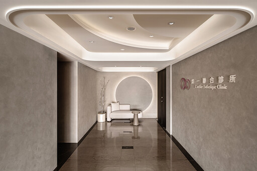
門前廊道右側規劃一面結合品牌logo的主視覺牆,盡頭則以圓形間接燈光呼應商標的圓弧造型,同時藉其似滿月散逸光照的形象,代表女性的柔性美。
Set up an artistic feature wall on the right of the door incorporating the clinic's logo. At the end of the corridor, indirect lighting behind the circular shape decoration features a full moon that shimmers and signifies the softness of femininity.
接待櫃檯、候診區
Reception Counter & Waiting Area
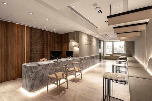
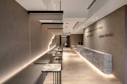
延續入門處鏝抹的特殊塗料,候診區的灰色基底營造宛如原始建物的水泥質感,搭輔牆面與地坪的木質紋理、櫃檯和等待區茶几的灰白大理石,圍塑滿盈自然氣息的舒緩氛圍。
The waiting area presents an unfinished texture in a grayish plaster tone via the same decorative paint as the entrance. In addition, the wood-textured walls and floors and the slate reception counter and coffee tables reveal a cozy and natural atmosphere.
看診室
Consultation & Examination Room
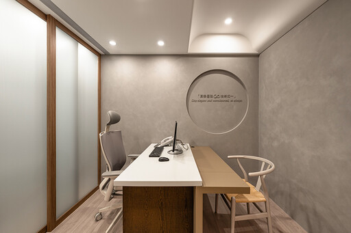
看診室兩側分別規劃入、出口,令問診結束的顧客無須原路返回前場,可從內診旁通道前往候診區或手術室,提升人員進出的便利性。
Two chambers with individual doors implement a convenient traffic design of no return. After consultations, the clients can move directly to the waiting area or the operation room.
恢復室
Recovery Room
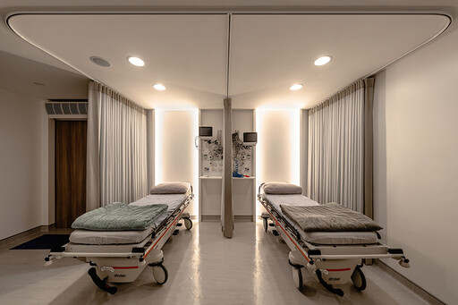
恢復室內部設計以間接照明點亮的矩形牆面,予以術後的客人們溫和舒適的休憩空間,並於天壁上方配置少量嵌燈,為醫者檢查、用針時提供充裕光源。
The indirect lighting surrounding the walls renders a comfortable resting space. Moreover, install a few downlights on the ceiling to provide ample illumination for the doctors inspecting and giving injections.
項目資訊
案名:柔曦映弧
項目類型:醫療空間
項目地址:臺灣臺北
設計團隊:簡兆芝設計
項目坪數:100坪
主要建材:木皮、木地板、鍍鈦、特殊漆、進口布藝

設計概念 Design Concept
沿循斑駁紋理的曲弧壁面轉入門中,映入眼簾的點點綠植為空間灌注盎然生機,而漫佈壁面的和煦光暈向內蔓延,點亮由溫潤木韻及細膩石材拼築成的樸實長廊,與廊道盡頭的明亮日光相迎、交融,齊組清新柔和的舒心環境。
呼應企業商標的圓潤造型、以及提供女性客群為主的醫美服務,簡兆芝室內設計 簡兆芝 主持設計師 於多處立面、天壁匯入流線、圓弧設計,象徵女子優雅的身體曲線,並將業者「以人工美呈現自然美」的理念作為設計核心,藉由同是人為的室內裝修展現天成美感,全案鋪敘木質、大理石與仿混凝土質感的特殊塗料,輔以入口旁植栽區、走廊末端引入的天光,挹來置身戶外般的純淨自然氣息,間或點綴布藝、鍍鈦鐵件等人造材質,堆疊細處層次感同時,完美呈遞融匯品牌概念的醫療場所。
Walk along the rustic textured wall and turn by the curved corner, and you may see refreshing greenery bringing an organic feel into the space. Pleasant lighting spills upon the walls and glows the pristine corridor with a warm wood tone and delicate marble. The clear, soft style contributes to a calming accommodation, inviting bright sunshine from the end.
The clinic provides aesthetic medicine services to female target clients, echoing the brand image by the logo in a round shape. INK DESIGN SPACE's presiding designer Kathy Chien adopted curves and rounded shapes to signify elegant women's body shapes. Besides, they developed the design based on the clinic's brand concept- “artificial beauty complements natural beauty.” Similarly, the interior decorations contribute to shaping a natural character. The project incorporates natural materials such as timber, marble, and concrete textures made from decorative paint coordinated with artificial fabric and metallic elements, adjoined green plants, and natural light. Exquisitely, comprehensive layering approaches reveal a perfect branding medical practice.
設計手法 Design Techniques
細劃場域 顧及隱私
Meticulous Floor Plans Preserve Privacy
考量醫學空間對機能的講究,設計師依各區功能劃分前、中、後場;前場的接待候診區為公共區域,透過於座位間懸掛可自由垂下的拉簾,予以顧客們具隱私的等待場所,而中場的問診區作為銜接前後兩區的中介空間,藉由設置於窗畔轉角的入口、櫃檯後方的出口,獨立訪客進離場的路徑,確保後場的診療室及術後休息區寧靜私密之餘,打造出流暢無礙的動線。
Concerning the facilitation of medical care, the designer planned three sections based on functional requirements. The front section is a public space, including reception and waiting areas. In the waiting area, curtains between the seats provide privacy for the clients. The consultation and examination rooms in the middle serve as a linking section, forming an exclusive, unimpeded flow. The layout of entering from the door beside the window and leaving by the door behind the reception counter ensures the tranquility and privacy of the rear treatment and recovery rooms.
匠心獨運 環保健康
Inventive Ideas & Eco-friendly Manners
候診區前方採用表面塗刷特殊漆的磁性牆,搭配上方磁石材質的字體,使業者未來變更標語時能輕鬆更動字母位置,避免拆字補漆造成的多餘耗材,另於注重衛生安全的手術房、實驗室等處施作設計團隊研發的環保建材,大幅降低VOC和病菌的孳生,成就友善健康的無毒環境。
A magnetic wall lined with decorative paint in the waiting area allows different slogans to be displayed, avoiding additional work and waste. Besides, eco-friendly building materials developed by the design team are adopted in the sanitized operation room and laboratory, eliminating VOCs and bacteria growth. As a result, they accomplished a healthy and non-toxic space.
全面服務 完善所需
Considering Services & Perfect Satisfaction
思及醫療商空縝密漫長的開業程序,設計師細膩控管時間排程,同時進行多項設計專案及工程執行,令業者取得執照後得以迅速開張,縮短承租空間後無法營業的空白期,自多元面向提升室設服務品質。此外,本案配置大量間接照明搭配質樸自然材質,不僅賦予人們歸宅般的溫馨放鬆感,也實現來訪者皆能自在無壓的業主期許。
Regarding the long-term and complicated procedures for opening practice, the designer shortened the construction duration by managing various works and projects in the meantime. It is an effective service that favors rental abatement under construction. Additionally, sizeable indirect lighting matches pristine textured materials, rendering a balmy and homelike feel to the clients. All visitors can relish in the unstrained atmosphere the business owner aspires to.


入門處
Main Entrance
門前廊道右側規劃一面結合品牌logo的主視覺牆,盡頭則以圓形間接燈光呼應商標的圓弧造型,同時藉其似滿月散逸光照的形象,代表女性的柔性美。
Set up an artistic feature wall on the right of the door incorporating the clinic's logo. At the end of the corridor, indirect lighting behind the circular shape decoration features a full moon that shimmers and signifies the softness of femininity.


接待櫃檯、候診區
Reception Counter & Waiting Area
延續入門處鏝抹的特殊塗料,候診區的灰色基底營造宛如原始建物的水泥質感,搭輔牆面與地坪的木質紋理、櫃檯和等待區茶几的灰白大理石,圍塑滿盈自然氣息的舒緩氛圍。
The waiting area presents an unfinished texture in a grayish plaster tone via the same decorative paint as the entrance. In addition, the wood-textured walls and floors and the slate reception counter and coffee tables reveal a cozy and natural atmosphere.

看診室
Consultation & Examination Room
看診室兩側分別規劃入、出口,令問診結束的顧客無須原路返回前場,可從內診旁通道前往候診區或手術室,提升人員進出的便利性。
Two chambers with individual doors implement a convenient traffic design of no return. After consultations, the clients can move directly to the waiting area or the operation room.

恢復室
Recovery Room
恢復室內部設計以間接照明點亮的矩形牆面,予以術後的客人們溫和舒適的休憩空間,並於天壁上方配置少量嵌燈,為醫者檢查、用針時提供充裕光源。
The indirect lighting surrounding the walls renders a comfortable resting space. Moreover, install a few downlights on the ceiling to provide ample illumination for the doctors inspecting and giving injections.
項目資訊
案名:柔曦映弧
項目類型:醫療空間
項目地址:臺灣臺北
設計團隊:簡兆芝設計
項目坪數:100坪
主要建材:木皮、木地板、鍍鈦、特殊漆、進口布藝

