【簡兆芝室內設計 簡兆芝】古樸糅合醇雅和風 木色沉香饗盡美饌
本文由OPEN編輯部撰寫
設計概念 Design Concept
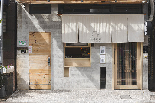
位於台北市中心,一座溫潤木質與樸實水泥築起的小屋,帶有清水模建築的原始魅力,流露醇厚的日式風情;錯落的光影之間,台灣韻味的紅燈籠於餐廳入口點亮畫面,四周裸露的樑柱、磚牆,勾勒粗獷工業風,映現複合混搭的嶄新面目,寄寓創新日料的品牌理想。
簡兆芝室內設計 簡兆芝 主持設計師 因應疫情改變的餐飲消費模式,場域善用長型格局,佈置L型吧台與外帶出餐口,方便業主同時與內、外賓客互動;而店家於空間大量使用的木紋板材,其可回收的綠建材特性,將和風美學重視的「自然」,進一步表現在環境保護方面。
Located in the center of Taipei city, a cottage made of balmy wood and clear cement, with the rustic charm of fair-faced concrete, reveals a substantive Japanese style. The Taiwan red lanterns at the entrance emit appealing light and shadow, and the exposed beams, columns, and brick walls manifest a rough and bold Industrial style, achieving a genuinely eclectic aesthetic look and embodying the vision of an innovative Japanese cuisine restaurant.
To adapt to the catering consumption patterns changed by the pandemic, INK DESIGN SPACE presiding designer Kathy Chien makes the most of the long-patterned layout and sets up an L-shaped bar counter and a take-out window facade to facilitate the storeowner to receive the customers. Exploit voluminous eco-friendly green building materials like timbers with recyclable characteristics to furnish the space, revealing the Japandi aesthetics that attach importance to nature.
設計手法 Design Techniques
創新日式 融入在地
Excellently integrate local features to create an innovative Japanese style
此案為新創日式定食餐廳,因此以木紋、清水模構築店面的和風底蘊,搭配象徵米袋的棉麻布,製作店外簾幕與室內壁飾;步入店中,抬頭即見代表台灣的紅燈籠,而天壁未經修飾的建築結構及管線,則帶有些許工業風,共組新穎的混搭美學,不僅契合品牌主打的在地化及創新性,更吸引周圍學校、當代藝術館的年輕客群。
As this is a newly opened Japanese cuisine restaurant, we choicely utilize cotton linen fabric symbolizing rice bags to make the outdoor hanging drapes and indoor wall decors and bring Japandi charms through rustic wooden and clear cement features. In addition, hang red lanterns representing Taiwan at the entrance, and then create the Industrial interior style with unadorned ceilings, walls, and exposed pipelines. The novel mix and match aesthetics comply with the design themes of localization and innovation, which successfully attract young customers from surrounding schools and contemporary art museums.
善用空間 因應疫情
Ingeniously configure the space to cope with the pandemic
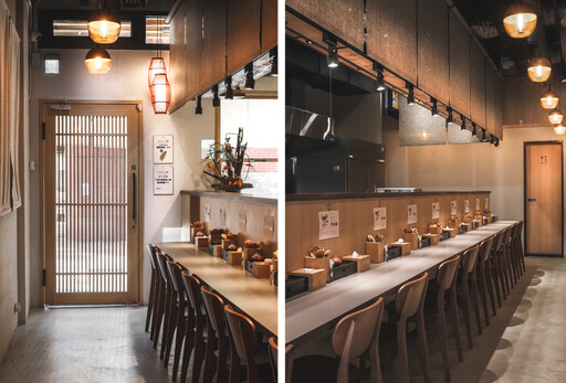
近年來餐飲業內用人數減少、外帶客源增加,配合消費模式轉變,店內設置一座L型吧台,將狹長空間分作廚房及用餐區,並精簡座位至15席,方便廚師直接與周圍客人互動;對外牆面增設出餐小窗,收銀區則安排於窗口前,讓員工可同時服務內、外顧客,即便疫情持續延燒,營運仍不受影響。
For the past few years, the catering consumption pattern has changed; people tend to take food home instead of eating in restaurants. Consequently, we divide the long-patterned space into a meal-preparing lot and dining area; set up an L-shaped bar counter with only fifteen seats, making the chef can talk with customers directly. Moreover, design a take-out window facade and arrange the cash register in front of the window so that the cashier can simultaneously serve indoor and outdoor customers. Hope to keep down operation impacts, even if the pandemic continues to grow.
環保建材 燈光聚焦
Skillfully make use of eco-friendly elements and befitting lighting fixtures
全案以木紋美耐板取代實木,表現日式元素之餘,亦具備防水耐刮特性,確保餐飲場所維護便利,且為可回收的環保綠建材;店內吧台上方裝設麻編捲簾,巧妙美化後方的餐具櫥櫃,其下方懸掛投射燈,令目光自然聚焦在眼前美食,於較為幽暗的環境中,躍升為空間主角。
We exploit eco-friendly green building materials such as laminating plastic sheets to replace solid woods to show the Japanese style feature. And take advantage of waterproof and scratch-resistant characteristics to assure easy maintenance in a dining environment. Hang linen roller blinds above the bar counter, which artfully shade the tableware cabinets behind. Then, install track lights to make customers focus their sights on the food, letting the fine cuisine becomes a leading role in the dim surrounding.
外觀
Exterior appearance
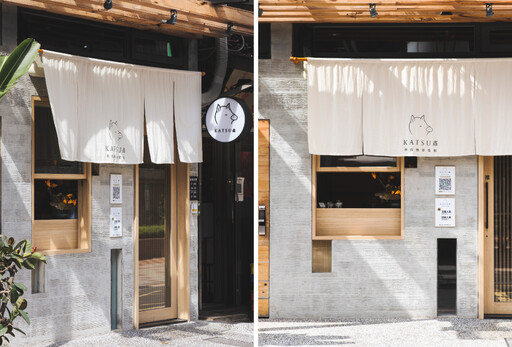
水泥模板鋪排的店面外觀,致敬安藤忠雄質樸的清水模建築;上方加裝木質格柵,白天引導陽光灑落於牆面,隨光影軌跡變化表情,夜間則改由投射燈照耀布簾logo,吸引往來路人的目光。
We finish the exterior appearance of the restaurant with rustic fair-faced concrete that pays homage to Master Tadao Ando. Then, install wooden gratings above the sidewalk to introduce the sunlight shining on the wall and generating vivid light and shadow. At night, the recessed downlights brighten up the restaurant logo on the hanging drape, successfully attracting the attention of passers-by.
室內
Interior design
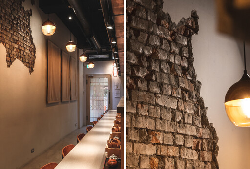
收銀台前擺放一座日式盆景,由花與樹枝帶出枯山水般的禪意;後方壁面裸露部分磚牆,其圖案為北海道地圖,藉由建築的舊有結構,與新建材產生對比美感,寄寓業主創新傳統日料的品牌理念。
We place a Japanese bonsai in front of the cash register to bring out a Zen vibe. Moreover, leave a Hokkaido-shaped brick wall of the original building, which carries out a contrasting beauty with the up-to-date building material and embodies the proprietor's creative concept of designing a traditional Japanese cuisine store.
項目資訊
案名:漫饗和食
項目類型:商業空間
項目地址:台灣台北
設計團隊:簡兆芝室內設計
項目坪數:12坪
主要建材:美耐板、編織捲簾、棉麻布簾、刷漆、水泥地、粉光、鐵件
OPEN Design動能開啟傳媒:http://www.openworld.tv/talk/

設計概念 Design Concept
位於台北市中心,一座溫潤木質與樸實水泥築起的小屋,帶有清水模建築的原始魅力,流露醇厚的日式風情;錯落的光影之間,台灣韻味的紅燈籠於餐廳入口點亮畫面,四周裸露的樑柱、磚牆,勾勒粗獷工業風,映現複合混搭的嶄新面目,寄寓創新日料的品牌理想。
簡兆芝室內設計 簡兆芝 主持設計師 因應疫情改變的餐飲消費模式,場域善用長型格局,佈置L型吧台與外帶出餐口,方便業主同時與內、外賓客互動;而店家於空間大量使用的木紋板材,其可回收的綠建材特性,將和風美學重視的「自然」,進一步表現在環境保護方面。
Located in the center of Taipei city, a cottage made of balmy wood and clear cement, with the rustic charm of fair-faced concrete, reveals a substantive Japanese style. The Taiwan red lanterns at the entrance emit appealing light and shadow, and the exposed beams, columns, and brick walls manifest a rough and bold Industrial style, achieving a genuinely eclectic aesthetic look and embodying the vision of an innovative Japanese cuisine restaurant.
To adapt to the catering consumption patterns changed by the pandemic, INK DESIGN SPACE presiding designer Kathy Chien makes the most of the long-patterned layout and sets up an L-shaped bar counter and a take-out window facade to facilitate the storeowner to receive the customers. Exploit voluminous eco-friendly green building materials like timbers with recyclable characteristics to furnish the space, revealing the Japandi aesthetics that attach importance to nature.
設計手法 Design Techniques
創新日式 融入在地
Excellently integrate local features to create an innovative Japanese style
此案為新創日式定食餐廳,因此以木紋、清水模構築店面的和風底蘊,搭配象徵米袋的棉麻布,製作店外簾幕與室內壁飾;步入店中,抬頭即見代表台灣的紅燈籠,而天壁未經修飾的建築結構及管線,則帶有些許工業風,共組新穎的混搭美學,不僅契合品牌主打的在地化及創新性,更吸引周圍學校、當代藝術館的年輕客群。
As this is a newly opened Japanese cuisine restaurant, we choicely utilize cotton linen fabric symbolizing rice bags to make the outdoor hanging drapes and indoor wall decors and bring Japandi charms through rustic wooden and clear cement features. In addition, hang red lanterns representing Taiwan at the entrance, and then create the Industrial interior style with unadorned ceilings, walls, and exposed pipelines. The novel mix and match aesthetics comply with the design themes of localization and innovation, which successfully attract young customers from surrounding schools and contemporary art museums.
善用空間 因應疫情
Ingeniously configure the space to cope with the pandemic
近年來餐飲業內用人數減少、外帶客源增加,配合消費模式轉變,店內設置一座L型吧台,將狹長空間分作廚房及用餐區,並精簡座位至15席,方便廚師直接與周圍客人互動;對外牆面增設出餐小窗,收銀區則安排於窗口前,讓員工可同時服務內、外顧客,即便疫情持續延燒,營運仍不受影響。
For the past few years, the catering consumption pattern has changed; people tend to take food home instead of eating in restaurants. Consequently, we divide the long-patterned space into a meal-preparing lot and dining area; set up an L-shaped bar counter with only fifteen seats, making the chef can talk with customers directly. Moreover, design a take-out window facade and arrange the cash register in front of the window so that the cashier can simultaneously serve indoor and outdoor customers. Hope to keep down operation impacts, even if the pandemic continues to grow.
環保建材 燈光聚焦
Skillfully make use of eco-friendly elements and befitting lighting fixtures
全案以木紋美耐板取代實木,表現日式元素之餘,亦具備防水耐刮特性,確保餐飲場所維護便利,且為可回收的環保綠建材;店內吧台上方裝設麻編捲簾,巧妙美化後方的餐具櫥櫃,其下方懸掛投射燈,令目光自然聚焦在眼前美食,於較為幽暗的環境中,躍升為空間主角。
We exploit eco-friendly green building materials such as laminating plastic sheets to replace solid woods to show the Japanese style feature. And take advantage of waterproof and scratch-resistant characteristics to assure easy maintenance in a dining environment. Hang linen roller blinds above the bar counter, which artfully shade the tableware cabinets behind. Then, install track lights to make customers focus their sights on the food, letting the fine cuisine becomes a leading role in the dim surrounding.

外觀
Exterior appearance
水泥模板鋪排的店面外觀,致敬安藤忠雄質樸的清水模建築;上方加裝木質格柵,白天引導陽光灑落於牆面,隨光影軌跡變化表情,夜間則改由投射燈照耀布簾logo,吸引往來路人的目光。
We finish the exterior appearance of the restaurant with rustic fair-faced concrete that pays homage to Master Tadao Ando. Then, install wooden gratings above the sidewalk to introduce the sunlight shining on the wall and generating vivid light and shadow. At night, the recessed downlights brighten up the restaurant logo on the hanging drape, successfully attracting the attention of passers-by.


室內
Interior design
收銀台前擺放一座日式盆景,由花與樹枝帶出枯山水般的禪意;後方壁面裸露部分磚牆,其圖案為北海道地圖,藉由建築的舊有結構,與新建材產生對比美感,寄寓業主創新傳統日料的品牌理念。
We place a Japanese bonsai in front of the cash register to bring out a Zen vibe. Moreover, leave a Hokkaido-shaped brick wall of the original building, which carries out a contrasting beauty with the up-to-date building material and embodies the proprietor's creative concept of designing a traditional Japanese cuisine store.
項目資訊
案名:漫饗和食
項目類型:商業空間
項目地址:台灣台北
設計團隊:簡兆芝室內設計
項目坪數:12坪
主要建材:美耐板、編織捲簾、棉麻布簾、刷漆、水泥地、粉光、鐵件
OPEN Design動能開啟傳媒:http://www.openworld.tv/talk/
