【之餘設計 李宜家】蒼鬱沁淨域 清雅漫生機
本文由 OPEN編輯部 撰寫
設計概念 Design Concept
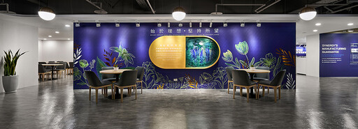
沉穩深藍相伴清新亮白,映襯其間的幾何與線型圖形,共同構築一處寬敞簡練的商業空間,凝神細看,細膩筆觸於壁面勾勒繽紛花草,簇擁訪客沉浸在蓊鬱風景,為洋溢科技感的場域增添一抹自然氣息,予人專業不失溫潤的柔和印象。
之餘設計 李宜家 設計總監 呼應注重天然與環保的品牌宗旨,透過壁面豐富的植物圖樣引入自然生機,並採用低碳、無綴飾的裝修手法,除了會議室、接待櫃檯及部分廊道,其餘空間不加裝天花板,形塑俐落工業風,而全案皆使用綠建材標章材料,在顧及環境之餘,更替員工及客戶營造無毒舒適的工作場域。
A soothing deep blue accompanies crisp fresh whites, enhanced by geometric and linear patterns, crafting a spacious and minimalist commercial space. Upon close inspection, delicate strokes on the walls depict lively florals, enveloping visitors in lush scenery, gently bringing the natural ambiance into the otherwise high-tech environment, leaving a professional yet welcoming impression.
In harmony with the brand's focus on natural and eco-friendly values, the lush botanical patterns on the walls introduce a sense of vitality and employ low-carbon, unadorned decoration techniques. Apart from the conference rooms, reception desk, and certain corridors, no false ceilings were used, creating a clean loft style. Throughout the project, Between design's design director Angela Lee carefully exploits materials bearing green building certifications, ensuring an eco-friendly and toxin-free workspace for employees and clients.
設計手法 Design Techniques
天然品牌 長遠歷史
Natural Brand with a Rich Heritage
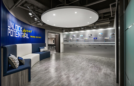
思及業主為銷售天然保健食品的廠商,壁面採用藍底大圖輸出彰顯企業主色,結合燙金及植物圖樣,打造自然原生的意象,同時將公司的歷史、願景、標語和產品製作過程等資訊安排於不同走道,供人自行瀏覽,認識品牌沿革。
Considering the proprietor's role as a distributor of natural health products, the blue-themed wall murals prominently feature the company's primary color. Combining hot stamping and botanical patterns, we artfully craft an image that exudes a sense of natural authenticity. Furthermore, throughout various corridors, information about the company's history, vision, motto, and product manufacturing processes are thoughtfully presented for visitors to explore, allowing them to familiarize themselves with the brand's evolution.
動線分流 合宜機能
Versatile Functionality with Efficient Flow
本案提供辦公、接待訪客及培訓員工的空間,故劃設三條獨立動線,方便出電梯後直接前往目標區域,分散人流、確保路徑暢通。公共領域內設置眾多小型會議室和桌椅,提供商談或簽約,而三間寬敞的職訓教室則將其中兩間連通,提升運用彈性。
We meticulously design three separate circulation paths to accommodate different functions in this project that encompass space for offices, visitor reception, and employee training. This layout allows individuals to move directly to their intended areas after exiting the elevators, preventing congestion and ensuring clear pathways. The public areas feature numerous small meeting rooms and tables for discussions or signings. Furthermore, two of the three spacious training rooms can be interconnected, enhancing flexibility in utilization.
柔和曲弧 半開放場域
Semi-Open Space with Gentle Curves
全案規劃為半開放式格局,形塑敞亮無壓的接待及辦公環境,搭配簡單素雅的燈具,打造現代時尚風範,而融入曲弧元素的造型天花板,不僅為此處增添柔和韻味,也無形劃分場域,維持乾淨俐落的視覺觀感。
We skillfully reconfigure a semi-open layout for this project, creating a bright and uncluttered reception and office environment. Paired with simple and elegant lighting fixtures, it embodies a modern and stylish ambiance. The incorporation of curved elements in the ceiling design not only adds a soft, pleasant touch to the space but also subtly defines areas, maintaining a clean and organized visual appeal.
開放式洽談區
Open Reception Area
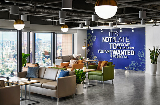
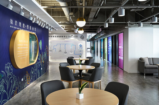
開放式洽談區結合窗外美景,於窗畔安排淺綠、亮橘等亮色系沙發,營造輕鬆自在的商談氛圍,對側壁面則設計膠囊形立體展板,內部運用層層堆疊的植物圖案壓克力板仿擬森林樣態,塑造天然純淨的印象。
Incorporating the delightful outdoor scenery, the open reception area features light green and bright orange sofas by the windows, creating a comfortable and inviting atmosphere for business discussions. On the adjacent wall, we meticulously set up a capsule-shaped stereoscopic display panel, with the insides mimicking a forest pattern created by layers of stacked acrylic boards with plant motifs, imparting a natural and pristine impression.

櫃檯
Reception Counter
櫃檯後方的主視覺牆以光柵板排列而成,隨觀看角度、光線照射形成浮動的粼粼波浪,回應品牌自然、陽光、健康的主題,中央石紋島台設有POS機,配合商品架旁的小型服務檯,供客人訂購和領取商品。
The main feature wall behind the counter is constructed with panels with a raster display system, creating a shimmering and shifting wave-like pattern as the viewing angle and lighting change. This design perfectly resonates with the brand's values of nature, sunlight, and health. In the center, we installed a stone-patterned island counter with a POS machine, complemented by a small service desk next to the product displays, providing customers with a place to order and collect their items.
內部空間
Interior Office Space
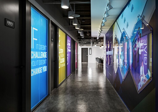
分佈於廊道上的小型洽談室設計不同顏色的玻璃牆,除了便於查看內部使用情形,繽紛色彩也讓場域更顯活潑趣味,而訓練教室門口則置入卡式座椅,供培訓員工稍作休憩。
We delicately present the glass walls of the small meeting rooms in different colors to complement the corridor. These colorful glass walls not only make it easy to see inside but also add a lively and playful ambiance to the area. At the entrance of the training classrooms, you'll find booth seating for the convenience of the training staff to take short breaks.
項目資訊
案名:Synergy
項目類型:辦公空間
項目地址:台灣高雄
設計團隊:之餘設計
項目坪數:300坪
OPEN Design動能開啟傳媒:https://www.openworld.tv/

設計概念 Design Concept
沉穩深藍相伴清新亮白,映襯其間的幾何與線型圖形,共同構築一處寬敞簡練的商業空間,凝神細看,細膩筆觸於壁面勾勒繽紛花草,簇擁訪客沉浸在蓊鬱風景,為洋溢科技感的場域增添一抹自然氣息,予人專業不失溫潤的柔和印象。
之餘設計 李宜家 設計總監 呼應注重天然與環保的品牌宗旨,透過壁面豐富的植物圖樣引入自然生機,並採用低碳、無綴飾的裝修手法,除了會議室、接待櫃檯及部分廊道,其餘空間不加裝天花板,形塑俐落工業風,而全案皆使用綠建材標章材料,在顧及環境之餘,更替員工及客戶營造無毒舒適的工作場域。
A soothing deep blue accompanies crisp fresh whites, enhanced by geometric and linear patterns, crafting a spacious and minimalist commercial space. Upon close inspection, delicate strokes on the walls depict lively florals, enveloping visitors in lush scenery, gently bringing the natural ambiance into the otherwise high-tech environment, leaving a professional yet welcoming impression.
In harmony with the brand's focus on natural and eco-friendly values, the lush botanical patterns on the walls introduce a sense of vitality and employ low-carbon, unadorned decoration techniques. Apart from the conference rooms, reception desk, and certain corridors, no false ceilings were used, creating a clean loft style. Throughout the project, Between design's design director Angela Lee carefully exploits materials bearing green building certifications, ensuring an eco-friendly and toxin-free workspace for employees and clients.
設計手法 Design Techniques
天然品牌 長遠歷史
Natural Brand with a Rich Heritage
思及業主為銷售天然保健食品的廠商,壁面採用藍底大圖輸出彰顯企業主色,結合燙金及植物圖樣,打造自然原生的意象,同時將公司的歷史、願景、標語和產品製作過程等資訊安排於不同走道,供人自行瀏覽,認識品牌沿革。
Considering the proprietor's role as a distributor of natural health products, the blue-themed wall murals prominently feature the company's primary color. Combining hot stamping and botanical patterns, we artfully craft an image that exudes a sense of natural authenticity. Furthermore, throughout various corridors, information about the company's history, vision, motto, and product manufacturing processes are thoughtfully presented for visitors to explore, allowing them to familiarize themselves with the brand's evolution.
動線分流 合宜機能
Versatile Functionality with Efficient Flow
本案提供辦公、接待訪客及培訓員工的空間,故劃設三條獨立動線,方便出電梯後直接前往目標區域,分散人流、確保路徑暢通。公共領域內設置眾多小型會議室和桌椅,提供商談或簽約,而三間寬敞的職訓教室則將其中兩間連通,提升運用彈性。
We meticulously design three separate circulation paths to accommodate different functions in this project that encompass space for offices, visitor reception, and employee training. This layout allows individuals to move directly to their intended areas after exiting the elevators, preventing congestion and ensuring clear pathways. The public areas feature numerous small meeting rooms and tables for discussions or signings. Furthermore, two of the three spacious training rooms can be interconnected, enhancing flexibility in utilization.
柔和曲弧 半開放場域
Semi-Open Space with Gentle Curves
全案規劃為半開放式格局,形塑敞亮無壓的接待及辦公環境,搭配簡單素雅的燈具,打造現代時尚風範,而融入曲弧元素的造型天花板,不僅為此處增添柔和韻味,也無形劃分場域,維持乾淨俐落的視覺觀感。
We skillfully reconfigure a semi-open layout for this project, creating a bright and uncluttered reception and office environment. Paired with simple and elegant lighting fixtures, it embodies a modern and stylish ambiance. The incorporation of curved elements in the ceiling design not only adds a soft, pleasant touch to the space but also subtly defines areas, maintaining a clean and organized visual appeal.


開放式洽談區
Open Reception Area
開放式洽談區結合窗外美景,於窗畔安排淺綠、亮橘等亮色系沙發,營造輕鬆自在的商談氛圍,對側壁面則設計膠囊形立體展板,內部運用層層堆疊的植物圖案壓克力板仿擬森林樣態,塑造天然純淨的印象。
Incorporating the delightful outdoor scenery, the open reception area features light green and bright orange sofas by the windows, creating a comfortable and inviting atmosphere for business discussions. On the adjacent wall, we meticulously set up a capsule-shaped stereoscopic display panel, with the insides mimicking a forest pattern created by layers of stacked acrylic boards with plant motifs, imparting a natural and pristine impression.

櫃檯
Reception Counter
櫃檯後方的主視覺牆以光柵板排列而成,隨觀看角度、光線照射形成浮動的粼粼波浪,回應品牌自然、陽光、健康的主題,中央石紋島台設有POS機,配合商品架旁的小型服務檯,供客人訂購和領取商品。
The main feature wall behind the counter is constructed with panels with a raster display system, creating a shimmering and shifting wave-like pattern as the viewing angle and lighting change. This design perfectly resonates with the brand's values of nature, sunlight, and health. In the center, we installed a stone-patterned island counter with a POS machine, complemented by a small service desk next to the product displays, providing customers with a place to order and collect their items.


內部空間
Interior Office Space
分佈於廊道上的小型洽談室設計不同顏色的玻璃牆,除了便於查看內部使用情形,繽紛色彩也讓場域更顯活潑趣味,而訓練教室門口則置入卡式座椅,供培訓員工稍作休憩。
We delicately present the glass walls of the small meeting rooms in different colors to complement the corridor. These colorful glass walls not only make it easy to see inside but also add a lively and playful ambiance to the area. At the entrance of the training classrooms, you'll find booth seating for the convenience of the training staff to take short breaks.
項目資訊
案名:Synergy
項目類型:辦公空間
項目地址:台灣高雄
設計團隊:之餘設計
項目坪數:300坪
OPEN Design動能開啟傳媒:https://www.openworld.tv/

